
The Petrovian Gallery
Page 1 of 3 • 1, 2, 3 ![]()
![]()
 The Petrovian Gallery
![]() by petrovich112 Sat Oct 25, 2008 11:51 pm
by petrovich112 Sat Oct 25, 2008 11:51 pm
also im aware the character is a little blurry and that was my intention


Last edited by petrovich112 on Mon Oct 27, 2008 11:38 pm; edited 3 times in total

petrovich112- Signature Artist
- Number of posts : 357
Age : 31
Smash Points/Trophies
Smash Points: 20
![]()
![]()

Fyro- Smash Apprentice
- Number of posts : 472
Age : 29
Brawl: : 2578 4639 5779
Smash Points/Trophies
Smash Points: 10 -

![]()
![]()
Re: The Petrovian Gallery
![]() by Zephron© Sun Oct 26, 2008 10:48 am
by Zephron© Sun Oct 26, 2008 10:48 am
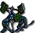
petrovich112 wrote:Hence the beggining of my more serious art career i begin with what i think is my best image which is off some show but i forget which so plz leave some criticism so i can improve further.
also im aware the character is a little blurry and that was my intention

Hm. Well, Petro, it's really unwise to have the focal point of your piece be blurry. You want people to notice the... uhm... picture, but when it's really blurry like that, it makes everything seem off. So next time, even though it was your intention, I don't recommend you blur the focal point.
The background seems cool, but very simple and not very fitting for the... focal point. The lines are cool, but you have been using them in nearly every sig you've been using. Next time, add some stock photos, or c4ds. Use blending options to make them go well together. I do see like, one in there, but it's very meek and only has pure red. Try to get more colors in there.
The text.. don't use that font... It's like those curly ends with slick lettering, it seems kind of girlish to me. And when you're pushing life to the max, that doesn't seem very fitting.
The border is nice, but blue sticks out like a sore thumb in contrast to the sig. This sometimes works, but try not to go completely on the other side of the color scale next time.
I know you wanted some criticism, so there's my two cents. I hope this will help you improve.

Zephron©- PK Knight

- Number of posts : 1615
Age : 31
Brawl: : 1934-2362-2797
Smash Points/Trophies
Smash Points: 75
![]()
![]()
Re: The Petrovian Gallery
![]() by petrovich112 Sun Oct 26, 2008 11:31 am
by petrovich112 Sun Oct 26, 2008 11:31 am
ohh and the 1 stock phot turned out red because i suck at coloring and instead used lighting
and the blur was to portray motion which probly could have been done differently
as were the lines and i has decideed to stop usin em more or less
and i just picked random font not really caring what it was
and i wasnt sure what color scheme would work with the character so i went with red
petrovich112- Signature Artist
- Number of posts : 357
Age : 31
Smash Points/Trophies
Smash Points: 20
![]()
![]()
Re: The Petrovian Gallery
![]() by Zephron© Sun Oct 26, 2008 11:36 am
by Zephron© Sun Oct 26, 2008 11:36 am
It's true you wanted motion, so just blur the hand, not the entire picture. Unblur the guy's face, and body. It's his hand that's moving.
Red scheme is fine... It's your descision.
Zephron©- PK Knight
- Number of posts : 1615
Age : 31
Brawl: : 1934-2362-2797
Smash Points/Trophies
Smash Points: 75
![]()
![]()
Re: The Petrovian Gallery
![]() by Zephron© Sun Oct 26, 2008 1:27 pm
by Zephron© Sun Oct 26, 2008 1:27 pm
It says BBM on his head @_@
Zephron©- PK Knight
- Number of posts : 1615
Age : 31
Brawl: : 1934-2362-2797
Smash Points/Trophies
Smash Points: 75
![]()
![]()
Re: The Petrovian Gallery
![]() by petrovich112 Sun Oct 26, 2008 1:30 pm
by petrovich112 Sun Oct 26, 2008 1:30 pm
and also i didnt care about the text because it was 2 am but ya i made a few changes hope its better
petrovich112- Signature Artist
- Number of posts : 357
Age : 31
Smash Points/Trophies
Smash Points: 20
![]()
![]()
Re: The Petrovian Gallery
![]() by GuruKid Sun Oct 26, 2008 3:39 pm
by GuruKid Sun Oct 26, 2008 3:39 pm
And yes, font style (just like every other little detail) is really crucial to completely harmonizing your artwork.
GuruKid- Head Honcho

- Number of posts : 383
Age : 35
Smash Points/Trophies
Smash Points: 15 -
![]()
![]()
Re: The Petrovian Gallery
![]() by Zephron© Sun Oct 26, 2008 7:23 pm
by Zephron© Sun Oct 26, 2008 7:23 pm
petrovich112 wrote:
Hmm. Well, the hand seems to be waay too blurry. Like even more than the last sig. I know you want motion, but with that much blurring it just seems x.x You might want to blur the outline of the hand. Hmm.
The text is better, seems a little too big though. Color sticks out like a sore thumb.. But I guess that makes it easier to read.. idk, tbh it looks bad to me.
The different background on the right side seems really weird. It's looking like some mush. I get why you did that but I'm still not liking it.
There isnt much flow... in either... or lighting... or composition. These take a LONG TIME to get down, I'm nowhere near masterful of them, but it seems you dont even add them. In your next sig, please consider these aspects.
One last thing, your sigs seem very empty. There's always some little BG then a stock photo. Seems just really empty a lot of the time. Add c4ds, and other pictures to add stuff. Make sure this goes well with the flow. Turn, or erase some parts of the picture to make sure it goes well. Or just change the hue.
Good to know you're working at it, try your best next time.
Last edited by Zephron© on Sun Oct 26, 2008 7:30 pm; edited 1 time in total
Zephron©- PK Knight
- Number of posts : 1615
Age : 31
Brawl: : 1934-2362-2797
Smash Points/Trophies
Smash Points: 75
![]()
![]()
Re: The Petrovian Gallery
![]() by petrovich112 Sun Oct 26, 2008 7:29 pm
by petrovich112 Sun Oct 26, 2008 7:29 pm
and i have lightin in to change colors of stuff and composition is what in this case?
petrovich112- Signature Artist
- Number of posts : 357
Age : 31
Smash Points/Trophies
Smash Points: 20
![]()
![]()
Re: The Petrovian Gallery
![]() by Zephron© Sun Oct 26, 2008 7:33 pm
by Zephron© Sun Oct 26, 2008 7:33 pm
petrovich112 wrote:two things its not really supposed to flow i remembered the shows called chaotic
and i have lightin in to change colors of stuff and composition is what in this case?
IMHO, Sigs should always have some sort of flow, whether it's meek or not, the only thing thats flow in the sig is because of the photo, with the guy shooting his hand out, which you really wanted to blur.
I see the.. lighting, but it has a very minimal part, and the actual chaotic guy isnt affected at all by the lighting, and only a corner of it has the effect of lighting.
Composition... you should make the shape or the style of the sig resemble the character in some way. If the show is called... chaotic, it would be befitting to have a chaotic background. The left side of the sig kind of is, but still, seems kind of like mush. Idk what it is @_@ And the rest.. just seems very empty.
Zephron©- PK Knight
- Number of posts : 1615
Age : 31
Brawl: : 1934-2362-2797
Smash Points/Trophies
Smash Points: 75
![]()
![]()
Re: The Petrovian Gallery
![]() by petrovich112 Sun Oct 26, 2008 8:44 pm
by petrovich112 Sun Oct 26, 2008 8:44 pm
im gonna pick something im interested in for my next pic so i can better match the styles and thx for the help i understand what you mean now
petrovich112- Signature Artist
- Number of posts : 357
Age : 31
Smash Points/Trophies
Smash Points: 20
![]()
![]()
Re: The Petrovian Gallery
![]() by For$@K3n KnIgHt! Mon Oct 27, 2008 10:05 pm
by For$@K3n KnIgHt! Mon Oct 27, 2008 10:05 pm
Good Job Petro! Your starting out so far good.The blurry I really don't care. It makes it so people Focus the center of that art piece. Which btw is that character from a show my little cousin watches. Great job again you should be motherly proud!

For$@K3n KnIgHt!- Smash Veteran
- Number of posts : 763
Age : 30
Brawl: : 1977.2102.9898
Smash Points/Trophies
Smash Points: 0
![]()
![]()
Re: The Petrovian Gallery
![]() by petrovich112 Mon Oct 27, 2008 10:11 pm
by petrovich112 Mon Oct 27, 2008 10:11 pm
petrovich112- Signature Artist
- Number of posts : 357
Age : 31
Smash Points/Trophies
Smash Points: 20
![]()
![]()
Re: The Petrovian Gallery
![]() by For$@K3n KnIgHt! Mon Oct 27, 2008 10:17 pm
by For$@K3n KnIgHt! Mon Oct 27, 2008 10:17 pm
But Having it blurry can make the person think that the center of attention in this picture is that character.
Lucario one is just epic!
For$@K3n KnIgHt!- Smash Veteran
- Number of posts : 763
Age : 30
Brawl: : 1977.2102.9898
Smash Points/Trophies
Smash Points: 0
![]()
![]()
Re: The Petrovian Gallery
![]() by Zephron© Mon Oct 27, 2008 10:18 pm
by Zephron© Mon Oct 27, 2008 10:18 pm
The new one is a decent bit better than the other one's you've done. It has a lot better resemblance to Lucario, but I really am not feeling anything... "aura-y" about the background. I felt you were going for that, but It just seems like one of those rainbow color shirts people have, with various water stains on there.
There's a defined line right down the middle, you should really blur that, looks kinda bad.
The lighting is okay... I mean, the Lucario in front is lighted just fine, but the rest of the sig has 0 effect from it. If there's a light source, be thorough, and make every part somehow affected.
There's absolutely no flow, and everything just seems to be sitting there. That's a problem : /
The text is better, the colors are good, but the font I'm not liking. It is also hard to read. Either bold it, or place it better next time.
Anyways... good sig Petro..
Zephron©- PK Knight
- Number of posts : 1615
Age : 31
Brawl: : 1934-2362-2797
Smash Points/Trophies
Smash Points: 75
![]()
![]()
Re: The Petrovian Gallery
![]() by petrovich112 Mon Oct 27, 2008 10:30 pm
by petrovich112 Mon Oct 27, 2008 10:30 pm
not sure what you mean by flow in this case.
and i dont know if its in photoshop but the program i use the lighting only effects the layer its in so its really difficult to get the same kinda lighting throughout
also you started six months ago where as i started like 3.5 weeks ago
petrovich112- Signature Artist
- Number of posts : 357
Age : 31
Smash Points/Trophies
Smash Points: 20
![]()
![]()
Re: The Petrovian Gallery
![]() by Zephron© Mon Oct 27, 2008 10:37 pm
by Zephron© Mon Oct 27, 2008 10:37 pm
Yeah, I did see his arm whited out, thought it was the lighting.
Flow is when you look at a sig, and think: "What direction is everything going?"
Is everything moving left? Right? Outwards? Inwards?
When everything is just sitting there, the sig feels just wrong. Giving flow to signatures helps a lot. It gives a sense of motion, of happening, so the sig looks and feels like it has a lot more going on.
As for lighting, you're gonna have to use multiple light effects in multiple layers. That's just how much effort you got to put into it to make everything go with eachother. You cant have layers that seem out of place.
Zephron©- PK Knight
- Number of posts : 1615
Age : 31
Brawl: : 1934-2362-2797
Smash Points/Trophies
Smash Points: 75
![]()
![]()
Re: The Petrovian Gallery
![]() by petrovich112 Mon Oct 27, 2008 11:39 pm
by petrovich112 Mon Oct 27, 2008 11:39 pm
petrovich112- Signature Artist
- Number of posts : 357
Age : 31
Smash Points/Trophies
Smash Points: 20
![]()
![]()
Re: The Petrovian Gallery
![]() by Kingdom Come Mon Oct 27, 2008 11:43 pm
by Kingdom Come Mon Oct 27, 2008 11:43 pm
Kingdom Come- Smash Veteran
- Number of posts : 770
Age : 30
Smash Points/Trophies
Smash Points: 5
![]()
![]()
Re: The Petrovian Gallery
![]() by Zephron© Mon Oct 27, 2008 11:45 pm
by Zephron© Mon Oct 27, 2008 11:45 pm
It was an improvement... I guess.
If you were trying to fix the lighting, take a gander at my sig. The lighting isn't perfect, but I say it's darn good. See how there's a defined dark and light eminating spots?
@ Kingdom:
Well, Idk about Petro, but I'd love to teach you, if you have photoshop and are willing to take slightly harsh constructive criticism.
Zephron©- PK Knight
- Number of posts : 1615
Age : 31
Brawl: : 1934-2362-2797
Smash Points/Trophies
Smash Points: 75
![]()
![]()
Re: The Petrovian Gallery
![]() by For$@K3n KnIgHt! Tue Oct 28, 2008 5:57 pm
by For$@K3n KnIgHt! Tue Oct 28, 2008 5:57 pm
Zephron© wrote:slightly harsh constructive criticism.
Har Har. Slightly?! lol made me chuckle after reading your posts in this zeph xD
For$@K3n KnIgHt!- Smash Veteran
- Number of posts : 763
Age : 30
Brawl: : 1977.2102.9898
Smash Points/Trophies
Smash Points: 0
![]()
![]()
Page 1 of 3 • 1, 2, 3 ![]()
![]()


|
|
|